
Build an Event Intensity Line Chart
We assume the reader is familiar with Apache Superset basics, including SQL. The purpose of this chapter is to illustrate, with a few examples, how to analyze and visualize data in the IREX event database using Apache Superset and SQL.
In this example, we will build a time diagram that shows:
- The overall number of IREX events ...
- ... in time intervals 30 minutes long ...
- ... over the previous week, ...
- ... classified by the modules that produced those events.
Create an Empty Chart
- Click the +Chart on the Charts page on the Apache Superset home screen.
- On the Select dataset list, click the IREX event database name, "kx_events" in our case.
- In the Choose chart type workspace, click Line chart.
- Click Create new chart to open the next screen, for formulating the query conditions to extract the relevant data from the database.
- Enter the chart name as shown, e.g., "Event intensity".
.webp)
.webp)
Formulate the Query to the Database
- We would like to have the event time plotted along the X-axis on the chart. This value is stored in start_time column of the event database, so click as shown to select start_time, then click Save.
- Select "30 minutes" on the Time Grain list.
- Metrics defines the metric displayed on the chart. In this example, it is the number of events, or COUNT in SQL terms. So, click as shown to select COUNT and then click Save.
- Dimensions are the attributes by which we are going to categorize chart data. In this example, it is the module that triggered events. The modules are in the module column, so click as shown to select modules and then click Save.
- Since we are interested in events from the previous week, set the Previous calendar week filter as shown and click Save.
- Click Create chart below.
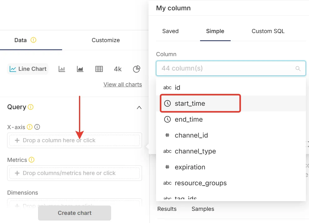
In a more general case, it might be some kind of combination of the columns in the database, constructed on the Custom SQL tab following the SQL syntax rules, e.g., like this.
.webp)
.webp)
In a more general case, it might be some kind of combination of the columns in the database, constructed on the Custom SQL tab following the SQL syntax rules.
More complicated filters can also be built on the Custom SQL tab, following the SQL syntax rules.
.webp)
Review, Customize, and Save the Chart
Click on Create chart sends a query to the IREX event database for data matching the conditions formulated at steps 1 - 5. The query is executed, and the resulting chart is displayed.
.webp)
Use the options on the Customize tab to customize the chart, e.g., add titles to the axis, change color scheme, etc.
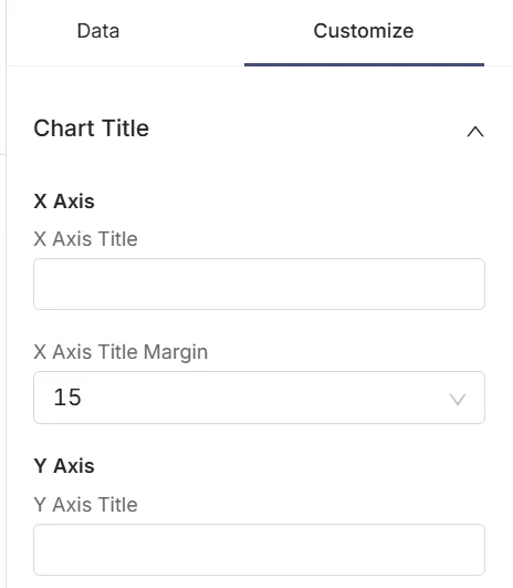
Click Save in the upper-right corner of the screen to complete the chart saving dialog.
.webp)
Update the chart
When the chart data needs updating, e.g., a week later, find the chart name on the list ...
.webp)
... click it to open and click Update chart to redraw the chart.